So, yes.
I just said a small prayer. A little one. I have never done that in my life, not once, not seriously. And I did it right before opening a blank file to start the revamped brand and visual design for ZenMode.
That felt worth writing down. So here we are.
If there's a hook, why can't we unhook it?
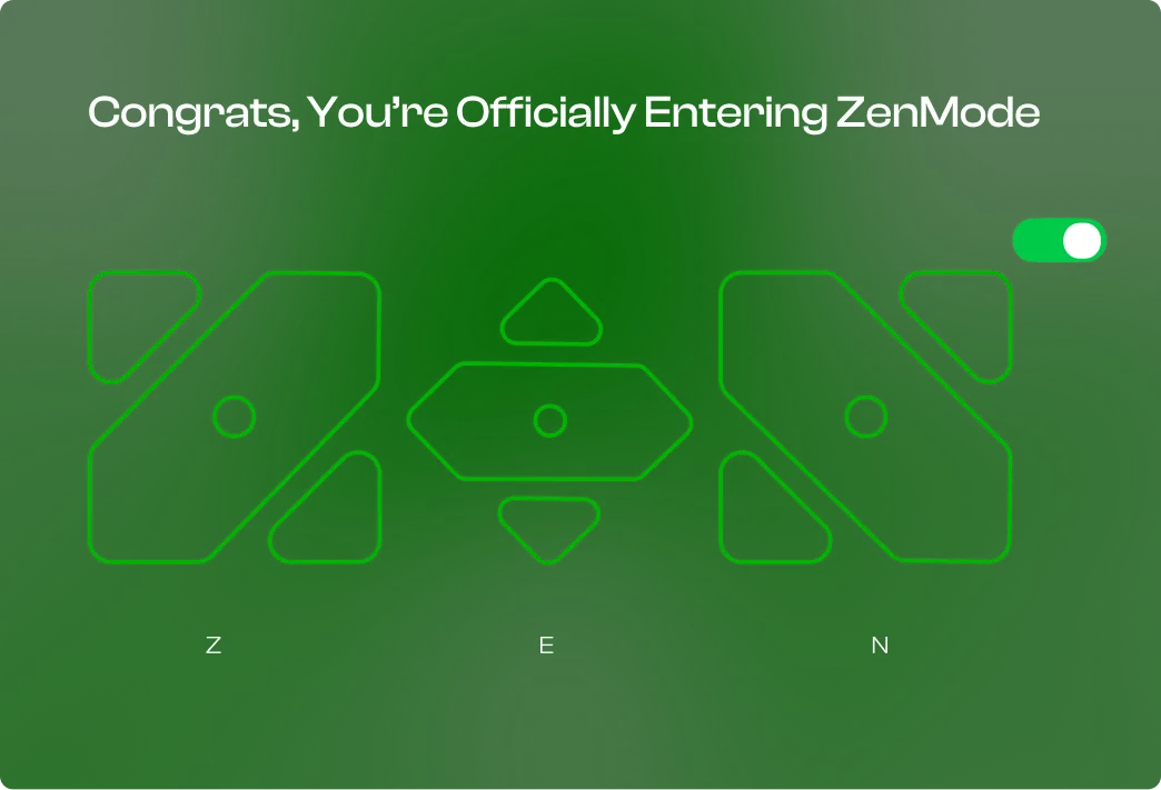
That's ZenMode. Reverse engineered, hook-less. The unhooking is the product.
Put this on first.
Arul Mei played on repeat while I designed and crafted the ZenMode OS revamp. It is warm, unhurried and a little nostalgic, like a friend who sits with you and asks for nothing. That is the feeling I want ZenMode to leave in your hand: it never rushes you, it just keeps you company.
The story
Where ZenMode came from, what V1 actually was, and why a revamp instead of an update. Six notes, written in order.
We started building ZenMode with one intention. Nothing more than that.
We met at FOSS United India in Bengaluru, 2025. Two people at a community meetup. I never imagined it would turn into whatever this is now.
Somewhere between V2 and V3 things shifted. We got feedback that genuinely warmed us, real messages from real people. We ran a monthly booth at IIT Madras. And I'll say this plainly: FOSS people are wonderful people. I hope you're one of them.
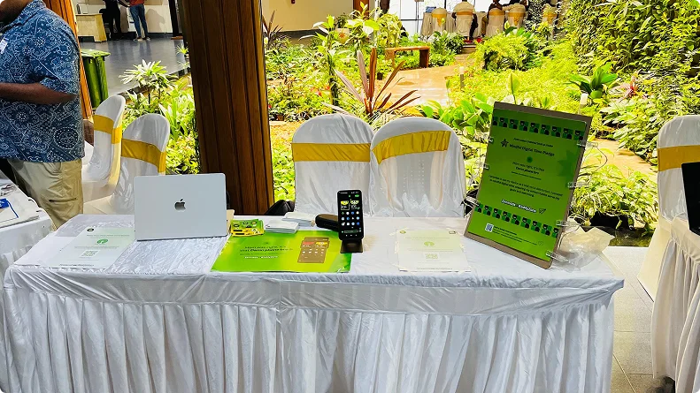
THE MONTHLY BOOTH · IIT MADRAS
Because we sat with it for a while, and “just ship an update” started to feel like a lie. We didn't want to add a feature and call it a release. We decided to revamp the whole thing and make it the best product we've ever built.
The honest reason is this. We are up against an entire generation of the smartest people alive who spend their working lives making sure you stay hooked. That's not me being dramatic, it's a job description. There are teams and budgets and roadmaps dedicated to keeping your attention exactly where it is right now.
There's even a documented method for it. Nir Eyal wrote the book. It's literally called Hooked.
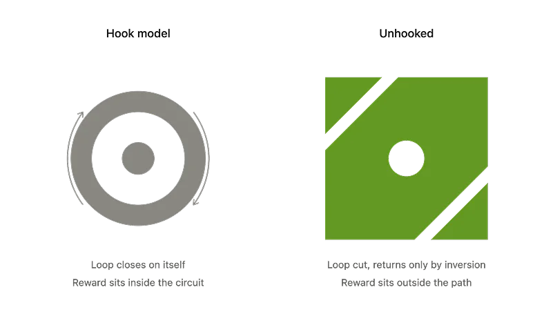
THE LOOP, CUT OPEN. THE REWARD MOVES OUTSIDE THE PATH.
“It's that damn phone.”
Trust me bro. She was right. If ZenMode helps even a million people on this earth build a healthier relationship with their smartphone and their time, I think our purpose is done. At least with ZenMode. Lol.
Right. This is what the prayer was actually for.
Here's my fear: that ZenMode ends up as just another open source product sitting in a list on F-Droid. Another repo. Another entry that nobody opens twice.
I heartfully believe this is going to impact millions of lives. And a product that believes that about itself can't look like an afterthought. The design system isn't decoration, it's the part that decides whether anyone takes the idea seriously enough to let it into their day.
So that's what I'm building next.
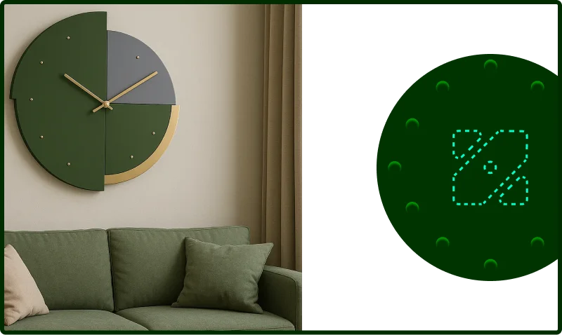

OBJECTS AND STICKERS · MINIMAL BASE, VIBEY SKEUOMORPHISM AS THE TEXTURE.
What I'm chasing in the revamp
A few notes from the same park bench, unfiltered.
Vibey. Excitement.
A rewarding experience, not a scolding one.
Minimal base, vibey skeuomorphism
Not flat, not nostalgia cosplay. Something that can live for years.
Buried for the patient
Small things for people who stay long enough to find them. Long run rewards, not dopamine crumbs.
Open source, all the way down
No dark patterns to hide, so nothing to hide.
Obviously.
Non-negotiable.
What is the one thing ZenMode does?
Not ten things. One.
The craft
The brand style itself, and the reasoning under every decision. Core, score, mark, colour, type, icons. Nothing here is decoration.
conjunction · although, though
Smartphones are addictive, Albeit we make it “Zen.”
One thing, and one thing only.
To help people reduce unintentional and meaningless phone use by creating an environment that makes intentional use easier, while providing accountability and rewards for healthier behaviour.
People don't need to abandon their phones. They need a better relationship with them.
ZenMode turns mindless phone use into intentional engagement through mindfulness, accountability and positive rewards.
Make the healthier choice easier than the impulsive one.
Eliminate screen time.
Make people use their phones as little as possible.
Shame users for using their phones.
Treat every minute of screen time as bad.
Block technology and disconnect people from the digital world.
Become another strict detox or screen-time blocker.
Reduce unintentional usage.
Reduce meaningless usage.
Increase intentional usage.
Make the healthier choice easier than the impulsive choice.
Create accountability without guilt.
Reward meaningful behaviour instead of only punishing bad behaviour.
Zen Score.
If the USP is accountability and reward, the product needs one number that can go up. Not a timer counting down on you, a score you earn back.
Up 6 from yesterday. Two intentional sessions, one drift.
PARTNER SEES THE SCORE. NOT THE SHAME.
The score, in one line
You start each day at 100. Unintentional usage deducts. Meaningful and productive usage earns back. The floor is 0, the ceiling is 100, there is no leaderboard to farm.
Pickups with no intent set. Sessions past the length you asked for. Apps you yourself tagged as unintentional.
Declared sessions that end on time. Productive-app time. Streaks of days where intent matched behaviour.
One card at the end of the day. Every deduction and every gain, itemised, with the minutes attached. No graphs you can't act on. The report is what your accountability partner receives, the number, the direction, and nothing else.
A square, one cut, one dot.
100×100. An 8px diagonal cut at 45°. Every corner rounded to the same 8px. The dot is 12px, and it sits in the gap the cut created.
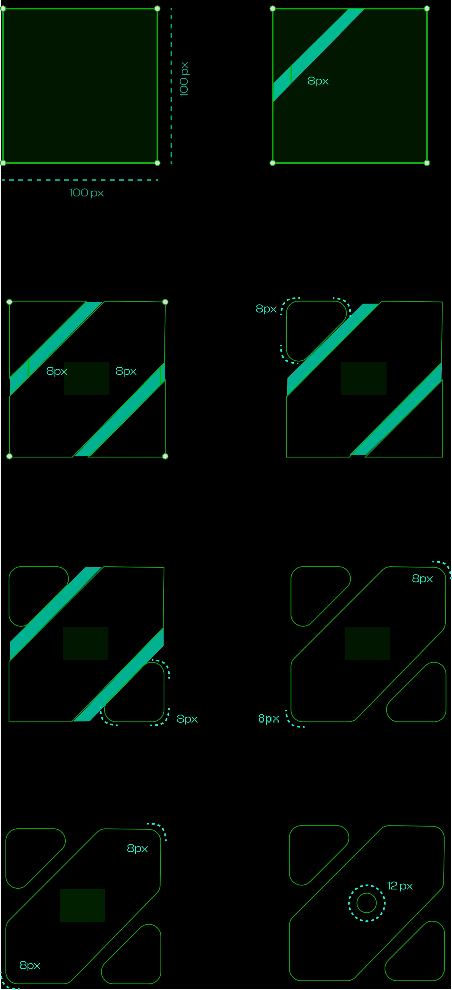
The cut runs corner to corner, so the two counters and the diagonal resolve into a Z before you're told to look for one.
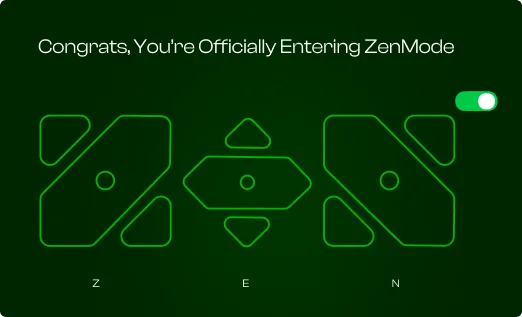
The motion primitive of the brand. One mark, rotated 90° twice, becomes Z → E → N. Every loader, splash and reward animation is that same rotation, never a new shape.
Same topology, one cut. The Hook is a ring, a continuous path where the end feeds the start. Slide a diagonal through that ring and you get exactly this mark: two counters that no longer connect. The logo isn't a shape invented next to the Hook Model. It's the Hook Model with the return severed. That's the thesis, drawn.
The counters still mirror. They sit at 180°. The form repeats, it just can't cycle. Repetition without capture.
The dot changed sides. In the Hook it's inside the loop, powering the return. In the mark it's in the gap the cut created, touching nothing, load-bearing on nothing. The return isn't produced by the system. It's what the system clears room for.
The long diagonal is the long needle, the minute hand mid sweep. The two chunks above and below it are the short hands, the little arrows pointing away from each other. Read it that way and the mark stops being a letter and becomes the thing the whole product is about, which is your time.
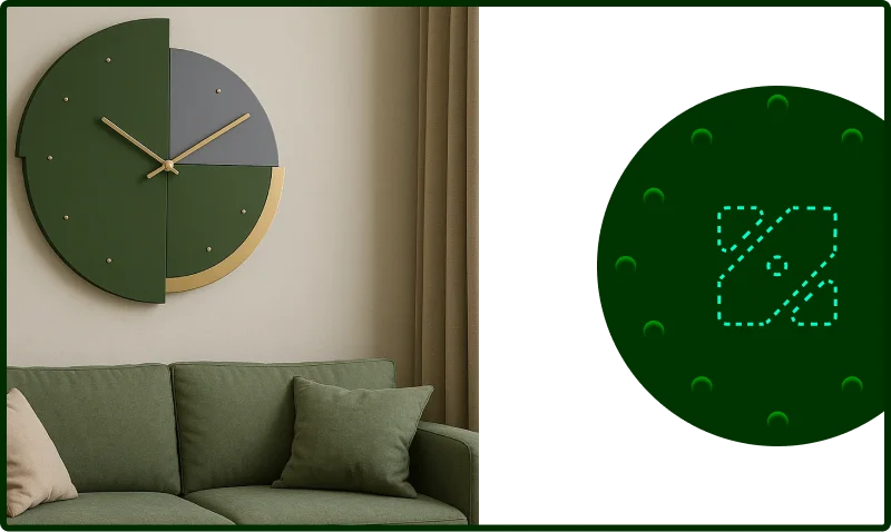
Four readings, one shape, and we honestly did not plan three of them. If you see a fifth thing in there, tell us. We will put the best one in the docs and credit you, even if it is a slice of pizza.
Green does the work. Orange and yellow do the reward.
Every ratio below is measured against the surface it's paired with. Anything under 4.5:1 is labelled and restricted, nothing in that group is ever allowed to carry body copy.
Used on the OS wordmark, the score bar, streak rings and reward moments. Never behind text, never as a page background. On dark surfaces only, so the yellow keeps its 9.5:1.
Three layers. Each one has a job.
Headlines, hero statements, the wordmark. Medium 500 only. Never below 20sp, never for a paragraph.
Every UI string in the launcher: titles, body, buttons, settings, empty states. 400 and 600 only.
Zen Score, timers, deltas, mono labels. Tabular by default so digits never jump while a session runs.
Android scale in sp, dp and tracking
Sizes in sp so they respect the user's font-size setting; layout in dp on a 4dp grid. Line height is a multiple of 4. Every scale step survives a 200% font-scale without clipping because no container has a fixed height.
20dp screen margin. 16dp card padding, 20dp on the score card. 12dp between list rows, 24dp between groups.
48dp minimum touch target, 8dp minimum gap between two targets. Body copy caps at 60 characters, on a 360dp screen that lands at 16sp with 20dp margins.
Clash tightens as it grows: -0.01em at 24sp down to -0.02em at 57sp. Geist stays near zero and opens up slightly below 16sp. Departure Mono never goes negative, the mono grid is the point.
Coloured glyphs, brand green, one weight.
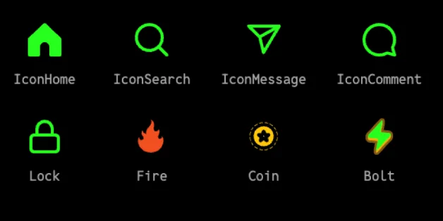
24dp box, 2dp stroke, 8dp corner radius to match the mark. Green #5BDF62 on dark, #0F7A18 on paper. Outline by default, filled only for the active tab.
Streak, coin and bolt are the only icons allowed to leave green, ember and amber, filled, with the soft inner highlight. They appear when something is earned, never in navigation.
Never two accent colours in one glyph. Never an icon alone as a touch target under 48dp. Never red for a deduction, deductions are ember, because a deduction is information, not a punishment.
Across devices
ZenMode leaves the Android home screen. Meet Zeno, the friend in every notch, then the horizon it draws, the cards it shares, one person's day across every screen, and the screens themselves.
Meet Zeno.
The friend in every notch.
ZenMode can't hide in your phone and hope you change. So it sends someone. Zeno is built from the mark, lives in the iPhone's Dynamic Island, the Mac's notch, the island ZenMode brings to Android, the iPad's bezel and the top of the web app, and only comes out when it matters: to cheer, to ask, or to sit with you when the day went sideways.
Every feeling, out of one notch.
A real-time render, not a photo. The screen is the live interface, so when Zeno comes out of the notch you are watching the actual nudge. Drag to turn the laptop.
Built from the mark, so it could never be anyone else.
Rotate the mark twice and it spells ZEN. Fold its corners up and it has ears. Zeno is drawn from the same four pieces as the logo, in a 150 × 100 box, so on every device it reads as ZenMode before it reads as a character.
The mark turns 45° at a time: Z, then E, then N. Zeno is the fourth step. The corners lift into ears, the band mirrors into a face, the dot becomes two eyes and the cut turns into a nose. Nothing was added that the mark didn't already have.
Eight feelings. Each one earns its moment.
Zeno feels with its ears, lids and mouth. Ears up is good news, ears down is a hard day. Colour follows the moment: green does the work, gold is earned, ember asks for attention, and dusk is for the days that went past the promise. Hover a feeling to say hello.
Every value is a spring. That's why it never feels stitched together.
The old nudges were keyframes glued in a row. Now the container, Zeno, its ears, eyes and each word are damped springs on one clock, at 240 steps a second. Happy is quick and bouncy. Sad is slow and heavy and never bounces. Pick a feeling and watch the same physics drive every curve.
Sampled from the same simulation that drives the island above · drag to scrub
Words leave first, the island last.
Leaving runs in reverse: words fade, Zeno waves its ears and rises, then the island closes. It takes about 70% of the arrival.
The container never overshoots.
The black shape settles critically damped. The bounce, the ear shake and the hop belong to Zeno, so the only thing that feels alive is the one that is.
Arrive in place, never vanish.
With reduced motion the island opens in 80 ms and Zeno is already there with the line written. The feeling survives, only the travel goes.
Your month, drawn as a horizon.
The Zen Horizon is ZenMode's pattern. It is cut from paper, drawn from data and lit by one of its own hours, calm enough to live behind a lock screen. The far range is your day, hour by hour. Four hills, one per week, are that week's daily screen time, so a calm month is a low, wide horizon. The mindful cell is one of the month's 720 hours, the one you were most mindful, lit. It sits at that hour, rises with your Zen Score and its light falls on everything in front of it.
Every hour you were mindful, lit.
Thirty days down, twenty-four hours across. Hover a cell. It remembers its neighbours.
720 cells: time with the phone, per hour, per day. The faint rules split it into four weeks.
Fold the month into one day. It rises at the hours you reach for the phone. The lit cell marks the hour you're most mindful.
Each week becomes one line, seven days across. Its height is that day's total screen time.
The day becomes the far range and the weeks become paper hills, the oldest furthest away. The mindful cell goes in last, at your most mindful hour, and its light falls on everything.
One of your 720 hours, lit.
The sun was borrowed from every other calm app; the cell is native: one of the month's 720 hours, the one you were most mindful, lit, its height the month's average score. It is the same square as the mark and the same cell as the grid, so every pattern, the favicon and the share card share one atom.
Same pattern, four different lives.
Bloom · every seed is one hour of the month. Midnight sits at the heart, the evening at the rim, so each ring is one hour of the day across thirty days. The lit seed is the hour you were most mindful.
Five patterns, one light.
All five are drawn from the same 720 hours, made of the same cell as the mark and lit by the same mindful cell. Each one answers a single question. Two of them live at the doorway, where Zeno lives: the kolam is drawn on the step every morning, and the garland hangs over the door.
Your day as a far range, your month as four paper hills, and one lit hour that lights them. The top of every Zen Card, the lock screen and the report.
Use: cards, wallpaper, reportNever: behind body copy
The month's 720 hours as seeds on a golden-angle spiral. Midnight at the heart, the evening at the rim, each seed the colour of how that hour felt.
Use: monthly recap, share cards, lock screenNever: under 120 px, the seeds turn to noise
Today's 24 hours as dots read like a clock, and one line woven round them. Calm hours hold hands, unplanned hours stand apart. A quiet day takes very few lines.
Use: the daily recap, packaging as a month of kolamsNever: a second line colour
A streak hung like a marigold toran: a string for every week, a bead for every day, kept days in marigold and today lit.
Use: streaks, milestones, share cardsNever: more than one month on a toran
Light through leaves. Every patch is a soft image of the cell, drifting as the leaves move. No data, just the quiet before it.
Use: loading, empty states, splashNever: a drift faster than 8 s
Thirty kolams, one per day.
Laid side by side, a month of kolams becomes a textile for the box, the booth and the splash. Every one is a real day. Only one is lit: the morning that held the month's most mindful hour.
One insight, one card, one horizon only you have.
A Zen Card is one thing ZenMode learned about you this month, on a punched tag. The horizon sits on top, one question in Geist, one answer in Clash, two lines of detail. It is the unit we share on every device: the monthly wrap, the partner view, the share sheet and the stickers at the booth.
Here's what people learned about their phone this month…
--framelens · seedGreen plus one reward hue per screen, the same as everywhere else in Albeit. A wall can mix zen and amber, or zen and ember, never all three. Ember cards are private by default and never appear on a public wall.
Type a name. The card becomes theirs.
In production the seed is the account id, never the display name, so a rename never changes the horizon. The insight sets the tone: streaks hang as amber garlands, costs are ember.
Kamal's day, added up across every screen.
Each screen measures its own time. ZenMode adds them up into one honest picture: when each screen was in use, where the minutes went, how they felt, and where Zeno spoke up. Position is always the screen. Colour is always how the time felt.
One cell is one minute, in the order it happened · colour is how it felt · hover a run for its time
Outer ring Phone · middle Mac · inner iPad · midnight at the top
Curves are handoffs: you put one screen down and picked another up within eight minutes. Each Zeno marks a nudge, and it only ever lands on the screen in use.
Sample data for one person · totals match the screens on this page
Every screen shows the same number within a second.
Each screen measures its own time and sends totals, never the raw record. The account adds them up into one Zen Score and sends it back out. Focus on one screen quiets the rest, and Zeno only ever speaks on the screen you're using.
- The Zen Score and what moved it
- Minutes per kind of app, per screen
- Sessions, intents and focus state
- Cards you choose to share
- App names and the raw Screen Time record
- What your notifications said
- Your location and your contacts
Quiet one, quiet all.
Start focus on any screen and notifications hold on every other one until it ends.
One nudge, one screen.
The screen with the latest input gets Zeno. The others stay quiet for that minute.
Nothing is lost on a plane.
Changes wait on the device, then merge by time the moment it reconnects.
The screens, flat and full size.
It starts in hand: two iPhones in titanium, running live. Then every screen flat, each built at its device's real point size: 393 × 852 on iPhone, 208 × 248 on Apple Watch, 412 × 915 on Pixel, 1376 × 1032 on iPad, 1470 × 956 on a MacBook Air, 1600 × 900 in the browser. Play one feeling on all of them at once and watch the same choreography adapt to six doorways.
Where today went, and what the month looked like.
Two screens from the ZenMode app. The Report counts the same minutes as the analytics above, cell by cell. Your October draws the month as a Bloom and the 13-day streak as a garland, still being strung.
393 × 852 pt each · natural and desert titaniumFolded, unfolded, and from the back.
One app, opened like a book.
Before Zeno shows up on a new screen.
// W3C DTCG · merges into zenmode-tokens.json
{
  "zeno": {
    "box": [150, 100], "ears": 38, "eye": 7.2, "nose": "the 8% cut at 45°",
    "skins": { "zen": ["#86E486", "#34AE41", "#0F5F1A"],
               "gold": ["#FFE59A", "#FFBE2E", "#C96E00"],
               "ember": ["#FFC197", "#FF7C30", "#B43F00"],
               "dusk": ["#D3DDCF", "#93A88F", "#4D654A"] }
  },
  "spring": {                        // response s, damping fraction
    "container":  [0.42, 0.82],  "exit": [0.44, 0.94],
    "zeno-happy": [0.38, 0.52],  "zeno-sad": [0.86, 0.92],
    "ears":       [0.16, 0.20],  "words": [0.44, 0.78]
  },
  "stagger": { "happy": 42, "pleasant": 58, "sad": 80 },
  "hold": { "happy": 2300, "pleasant": 2800, "sad": 3300 }
}
The island Android never had.
Android phones have a camera hole and nothing around it. ZenMode is your launcher, so it can draw its own island there: Zeno and your score at rest, a timer while you focus, and the whole nudge when it matters.
Compact · 112 × 32 dp · Zeno and your score, wrapped around the camera
The system
Everything above, written down as rules you can build with. Tokens, type, grid, motion, sound, pattern. And what never to do.
Room to breathe, a floor to stand on.
The mark is a 100 unit square. Keep a quarter of it clear on every side, never draw it smaller than 24 px, and let it be read four ways. Then leave it alone.
Below 24 px the cut closes and the dot vanishes. At that size use the dot alone, or nothing.
Every token, both themes, measured.
The table is generated from the token source, so it cannot drift from the site. Contrast is computed live against the token's own ground, in the theme you are looking at.
| Swatch | Token | Light | Dark | OKLCH | Role | Contrast |
|---|
Actions, links, the active state, the mark. If a screen has one colour, it is this one.
Amber for something earned, ember for something to notice. Pick one. The gradient is both, and it is rare.
Green, amber and ember on one surface reads as a warning light. The product is calm, so the palette is too.
Eleven steps. Three voices.
Every size on this site is one of these. The metrics beside each row are read from the page, not typed in, so they are true at the width you are reading.
Medium 500, nothing else. Headlines, the wordmark, one line that has to land. Never a paragraph, never below 22 px.
Everything you read. 400 for text, 500 for labels, 600 for a title inside the product. Loaded late, so it has a metric matched fallback.
Scores, times, deltas, eyebrows. Always tabular, always tracked open, never negative tracking. The mono grid is the point.
A running timer must not breathe sideways. Every number on the site carries font-variant-numeric: tabular-nums.
Clash Display and Geist each have a local fallback face with size, ascent and descent overrides. While the real font is still on its way, lines sit where they will end up, so the swap moves nothing.
"Clash Display Fallback" size-adjust 96% ascent 92% descent 24%
"Geist Fallback" size-adjust 100% ascent 95% descent 24%
One cell, one unit, one month.
A cell is 12 px with a 4 px gap, so the unit is 16. Twenty four hours across, thirty days down: 720 cells, one month. Every space and every radius on the site comes from the same cell.
12 + 4. The cell has a 2 px radius, the same proportion as the mark's 8 on 100.
Hours across, days down. The one green cell is the mindful cell: the hour you were most present, this month.
One column, 1240 px wide, centred. Gutters scale from 20 to 40 px with the viewport. Text never runs past 62 characters.
Twelve steps, each a stack of cells. 4, 8, 12, 16, 20, 24, 32, 40, 48, 64, 96, 128.
Small things stay square: 6 and 8 for chips and inputs. Cards sit at 20 and 24. 34 is only the phone. Full is a pill.
Three curves. Six durations. One clock.
Calm for almost everything. Settle when something lands. Breathe for what never stops. Only Zeno is allowed to overshoot.
Hover, colour, opacity, a card lifting. Fast in, soft out.
Something arriving in place: a sheet, a card, the rail. Decisive, then still.
The ambient loop: the pulse, the sound bars, the hero light. Symmetric, 6.4 s.
- 01Transform and opacity only. Nothing animates layout.
- 02Reveal once, from below, 12 px, 640 ms calm, staggered 60 ms.
- 03Parallax only around the renders, never on them.
- 04Only Zeno overshoots. Everything else settles.
- 05Reduced motion arrives in place. Nothing vanishes.
- 06One clock: 240 Hz springs for Zeno, one frame loop for every canvas.
- 07Pause offscreen. If you cannot see it, it is not running.
Root D. Pentatonic. Muted until you ask.
Seven sounds, all in D major pentatonic over two octaves from D4. Nothing repeats exactly: every note carries a little detune and a little gain drift, so the site never ticks like a machine.
| Kind | Pitch | Envelope | Gain | Rate limit | When | Play |
|---|---|---|---|---|---|---|
| tick | sine, rises with the cell's position | 6 ms attack, 90 ms release | .35 | one per 40 ms | a cell fills | |
| tick-soft | one octave lower | 6 ms attack, 60 ms release | .18 | one per 80 ms | hover | |
| reveal | D4 F#4 A4 D5, rising over 600 ms | four notes, 600 ms | .25 | once per wave | a grid wave | |
| done | dyad D5 + F#5 | 1.2 s release | .30 | once | 720 of 720 | |
| tone | D2 or A2, alternating | 400 ms attack, 1.6 s release | .22 | one per 4 s | a Part hand-off | |
| toggle | two notes, up for on, down for off | short | .25 | on press | the sound button | |
| ambient | D2 + A2, detuned ±0.4 Hz | lowpass breathing 180 to 420 Hz every 6.4 s | .06 | continuous | the hero, while in view |
- 01Muted by default, and remembered. The choice survives a reload.
- 02Never before a gesture. The first sound follows a tap or a click.
- 03Master ceiling −18 dBFS. No attack under 8 ms, except ticks at 6.
- 04Nothing repeats exactly: ±3% detune and ±15% gain on every note.
Five patterns, three fields, one cell.
The family draws a person's time: the month as a horizon or a bloom, the day as a kolam, the streak as a garland, and the quiet before any data as light through leaves. The system patterns draw time itself. All of them are made of the same cell as the grid and the mark, and lit by the same mindful cell.
One cell of the 720, with two halo rings, at the hour you were most mindful. Its height is the month's average Zen Score. It is the same square as the mark and the same cell as the grid, so the horizon, the grid, the favicon and the share card all share one atom. The old disc was borrowed from every other calm app. The cell is native.
Eight pairs. Keep the left column.
If a screen looks wrong and you cannot say why, it is usually one of these.
The new sheet. Zeno came along.
The booth sheet for v4. Zeno in five feelings, the island it lives in, the score it guards, the horizon it draws, and the mark turning into a friend. Peel one off. Hover them, they notice.
damn phone.
all the way down
Five more for the booth. The cell that replaced the old disc, the month as 720 hours, the hour that isn't here, the version, and the sound you have to ask for.
isn't here.404 · THE REST OF THE MONTH DOES
 v5REFINED
bounces
DIE-CUT, 5PX WHITE BLEED, MATTE. HOLO FOR THE BOOTH. ONE PER VISITOR, TWO IF YOU ASK ZENO NICELY. THE V5 SET PEELS OFF THE SECOND SHEET.